5/28/2025
Woven for Rebecca Mezoff’s Summer of Tapestry 2025, prompts for Earth and Water.
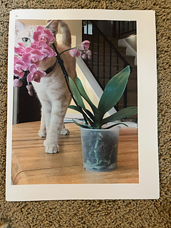
This is a photo I really wanted to weave a tapestry based on for quite a while already, and am eager to start.
I think the lower half of it is good for earth (the stable wooden table, the flower pot with bark and roots, and the cat’s legs).
The second half has the waterfall of flowers and my beloved cat, Luna (cats are liquid). There is a lot of emotion here for me, since I am Luna’s human and she is my cat, so it is a work of love.
Two halves for prompts 1 and 2, a month, which is doable for me, plus I may have time for a mini tapestry or two as well which is roughly how much weaving I did in May.
I printed out two copies of the photo. I will attach one of them to the back of my loom as a cartoon. I plan to improvise where/how to simplify on the fly. This has worked for me very well for a few tapestries I have done, and so I shall continue this practice.
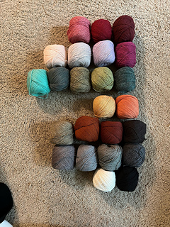
Here is the yarn I have available (I also have some blue and purple that I am less likely to use). I have no intention of using all these colors, but will pick and choose as I go.
The yarn is Queensland United, which is 55% lambswool and 45% cotton (so soft a delight to work with). It is sports weight yarn I think. Anyway, it works well for me at 12 epi.
5/30/2025
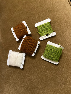
so the good news is: I made progress, and I love how the flower pot turned out - I used two strands of Faro yarn for most of it (brown+white or green+white). Even though I mostly am using a thicker yarn than this but I figured for doubling I would use the thin Faro.
The bad news is that now I have a section that has warp threads that are further apart, and others where they are too close together. Woops! Was not paying attention. But this has happened before, and I wove on, and it all turned out ok in the end, so I think I shall do that again. How would you handle this situation? And how would you help ensure it does not occur again?
Btw, I chose to make the table darker and more drab on purpose because I want more contrast between table and cat, and I wanted to save the nicer colors as options to use for cat. If you zoom in, you may notice that I am using both a drab brown and a grey to weave the table to make ot look less monotone but there is not much contrast there. I am using the dark brown for the occasional thin stripes on the table though. Not following the photo exactly for these parts, but I plan to follow it closer for my cat and the orchid blooms.


 handspun
 queue
queue favorites
 friends
 needles & hooks
 library