Color pairing recommendations! See pics at end
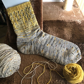
Three of my patterns (Icinkles, Tentoecles, Heelstrike) use slipped-stitch colorwork over one-row stripes. Having swatched and knit multiple versions of them in the last few years, I’ve developed an opinion on what looks best to me, and have drawn up some rules to help me when pairing colors. I’m sharing them in case anyone also struggles to choose colors but you should absolutely feel free to break any or all of these rules in your own choices!
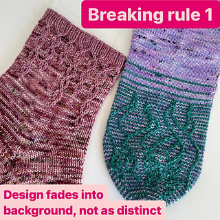
Rule 1: the foreground color needs to be lighter, brighter, or otherwise “pop” more than the background color .
Our eyes naturally want to focus on the brighter colors, and you don’t want to focus on the background here. Lighter colors usually seem brighter but some, like yellow, will always pop out more.
Rule 2: the foreground color needs to be solid or semisolid.
My lavender example would show much more clearly without the blue speckles.
Rule 3: choose low or medium contrast between the two colors. High contrast will create distinct stripes in the background which detract from the foreground design. It helps a lot to break up the stripes if your background color is speckled or variegated. Bonus points if the background shares a tiny bit of the foreground color, since that will blend it really well.
I’ve added the grayscale of my original 3 socks as the last slide so you can see they are all fairly low contrast. The gold/gray in the Icinkles Socks actually looks the same in grayscale- all of the contrast is provided by the yellow gold popping more than the gray.
OG Icinkles notes
Rem: 76g/12g after 1st sock
Pair extrapolates to 48g main/16g mini = 64g total


 Maliase notebook
  handspun
 queue
queue favorites
 friends
 needles & hooks
 library